>>>To ARTISTIC PRINTING images ALBUM


We tend to think of all Victorian design as overly ornate, cluttered and sentimental. Yet between the late 1870s and the mid-1880s a group of American and British letterpress printers developed a design aesthetic that, at its best, was clean, bold and graphic. In its purest form, “Artistic Printing”—as the practitioners themselves labeled the approach—used metal type and brass rules almost exclusively. The results often appear quite fresh to our 21st century eyes.
In 1870, Oscar Henry Harpel of Cincinnati published his groundbreaking TYPOGRAPH, OR BOOK OF SPECIMENS,
a book of information, suggestions and specimens for letterpress job printers which advocated clean, thoughtful typography and the creative use of color. Artistic Printing (also known as "Fine Printing" at the time) was the creation of a handful of American printers: John Franklin Earhart of the Cincinnati Type Foundry, Andreas Valette Haight of Poughkeepsie, New York and William Kelly of Kelly & Bartholomew in New York City.
It was an era of keen competition in the world of printing. The explosion of chromolithographic color printing was attracting many clients to lithographers rather than letterpress printers. Lithographers (“The Followers of Senefelder”) enjoyed greater artistic freedom due to the medium itself: whatever could be drawn on or transfered onto litho stones could be reproduced. Lithographers could seamlessly meld type and images together in increasingly elaborate compositions. Through the 1880s and 1890s, the so-called “Gaslight Style” became prevalent around the globe . . . elaborate compositions of layered elements, cast shadows, overlapping type and images, ribbons, diagonal bands and all manner of simulated depth. Steel and wood engravers could also produce this sort of work, because they too could control the placement of all type, pictorial elements and ornamentation.
Letterpress printers (“The Followers of Gutenberg”) could not do the same. In letterpress, individual pieces of type, vignette blocks, portrait blocks and decorative “cuts”—all “type high” (.9186 inches, 23.2 millimeters)—are arranged in a form and locked up tightly for inking and printing. Elements sit shoulder-to-shoulder and cannot overlap. Much letterpress job printing of the era had become mundane . . . lines of centered display type, perhaps with a border, and solid blocks of text. It was the age-old formula of book printers, conceptually unchanged since the invention of moveable type.
By the 1870s, type foundries were tremendously expanding their offerings, creating a host of increasingly decorative, ornate—even grotesque—type faces. Many letterpress printers had taken to buying these display fonts in order to appear au courant, and proceeded to throw all sorts of discordant fonts together, the more the merrier. This was especially the case with handbills, announcements, broadsides and the like, where each line of type might be set in
a different typeface.
William James Kelly (more below) called the old school the “Routinists”, and celebrated instead a perceived “feeling of independence in the air”, a “desire to produce original work”. (The American Model Printer, Vol.1 No.1 October 1879 p.6) The creators of Artistic Printing were of the belief that letterpress printers could and should develop their own refined, tasteful and sophisticated style; that they could use artfully arranged type, brass rules and color tints from carefully chosen color palettes to create elegant work. At their best they did.
The finest and purest examples of this sort of work are found on the trade cards, advertising and specimen pieces of the typographers and printers themselves; and on ephemera they created for printing-related suppliers of inks, rollers, paper and the like. These promotions display great skill in both composition and presswork. Given that these designs were worked in lead and brass, many of the results are quite amazing. Type elements and metal rules were induced to do unusually graceful and inventive things.
The trade cards and advertisements done by these typesetters/printers for their own services—created just as they liked, no third party client involved—represent Artistic Printing at its best. Not all efforts were successful, certainly; and over time, as the style was attempted by others with whatever metal type and whatever talent they had on hand, some truly horrible work was produced. Be it ever so.
And even for the best Artistic Printers, outside commercial projects for paying clients were a challenge. These typically ended up less than clean and elegant: then as now, paying clients tended to insist upon a lot of words, a product illustration or two, perhaps even a factory view. While Artistic Printing practitioners did what they could to marry client needs with their own preferred visual vocabulary of strong diagonals, circles and bent rules, the final effect was often less than thrilling. They did what they could.
John Franklin Earhart (of Columbus and later Cincinnati, Ohio) seems to have been long interested in pushing the envelope. An early participant in “Artistic Printing”, he invented The Wrinkler, a device for bending brass rules smoothly in intricate ways. Earhart spent years creating his book The Color Printer, A Treatise on the Use of Colors in Typographic Printing, which he was finally able to get out in 1892. The book demonstrates multiple color impressions, mixing and overprinting various ink colors, embossing, borders, corners, ornaments, metallic inks, special papers, etc. Though printed in a small edition, the book required 625 forms and 1,625,000 impressions! Earhart was an early adopter of the halftone process and three-color (later four-color) printing. He also put out a second book for printers in 1897, The Harmonizer, a beautifully printed book which demonstrated designs in various inks on various papers.
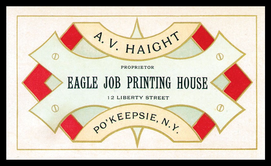
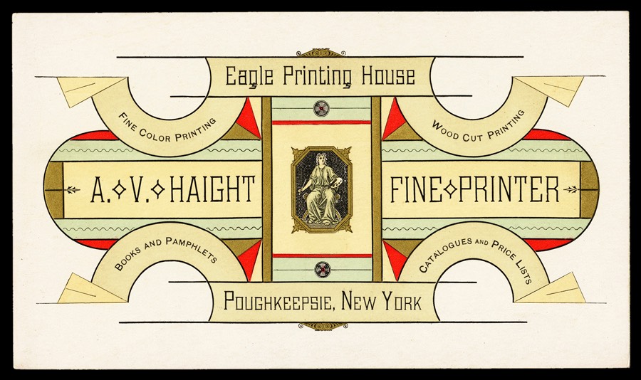
A. V. Haight
Andreas Valette Haight was one of the best American “artistic printers”. One account relates that in 1878 the proprietors of the Poughkeepsie, NY Daily Eagle newspaper decided to split off their book and job printing projects as a separate operation, and hired Haight, who came from Ulster County, New York (born 4 Feb 1842 in Ellenville), to run it. In Vol. VI (1885) of the Printers International Specimen Exchange, Robert Hilton of Field & Tuer in England ran a tribute to Haight, detailing his printing background and Civil War service, states that "In 1874 [Haight] took the position of superintendent of the Roundout [Kingston, NY] Freeman newspaper, and filled it so acceptably that he soon became a stockholder, with control of the business management as secretary and treasurer. In 1878 Mr. Haight severed his connexion with the Freeman office and started in business own his own account, at Poughkeepsie." In any event, in 1884 and the firm of Haight and Dudley was formed. Haight & Dudley, which ran eight presses, published a popular annual "Specimens of Printing", selling some five thousand copies in 1886. Haight was particularly adept at overlapping tints to produce additional colors. He also designed several type faces and sets of ornaments. Below is a view of the Eagle Printing House in 1887:

William James Kelly was the editor of the The American Model Printer (AMP), a printing and typography periodical published by Kelly & William H. Bartholomew in twelve issues between 1879 and 1882. It was the official organ of the International Typographic Union of North America, and billed itself as “The Most Elegant Typographic Journal in the World.” Its primary focus was the Artistic Printing movement, and information can be found in the The American Model Printer which is not available anywhere else . . . who designed a particular trade card, what inks and techniques were used in its production, who served as foreman on a particular piece, and the like. Printers from the United States and abroad submitted their own samples of job work for discussion and design analysis. Finely printed Artistic Printing specimen designs appeared in each issue. Earlier, Kelly had represented American printing at the Paris Exposition of 1878.
Here is a taste of Kelly’s writing, a description of one submitted specimen in the then-popular Japanese style: “Business card of Review and Herald, Battle Creek, Michigan. Uses Japanese border elements from MacKellar, Smiths and Jordan. Balconies facing an open river down which float small sailing craft . . . and water grass. In the distance are rolling mountains, above these is prominently suspended a small panel with the name of the office printed in gold, on a field of black, with a white and carmine edge. The bordering around the entire design is so executed as to present the appearance of a neat frame around a water-color painting.” (AMP, Vol.1 No.4 January/February
Other Americans considered key in the Artistic Printing movement were New York engraver Joseph A. Adams,
James Glaestaeter (of Thitchner and Glaestaeter in New York), Samuel Reed Johnston (of Eichbaum and Company in New York) and Theodore L. DeVinne (The DeVinne Press in New York). Glaestaeter, who invented useful type distribution machinery, is credited as the first letterpress printer to use tint blocks. DeVinne was quoted as saying "True success is not the mere making of money, but the production of meritorious work". Johnston invented a decorative pattern process he named "Owltype", later inspiring Earhart's "Chaostype". Anton Halauska in Austria dveloped a patterning he dubbed "Selenotype".
Vivian Ridler wrote that “Artistic Printing . . . may be said to have started in America with Oscar Harpel’s TYPOGRAPH, OR BOOK OF SPECIMENS . . . although its specimens give little idea of the glories that were to follow. A better claim can perhaps be made out for William Kelly . . . of whom an admirer wrote: ‘Art printing began when William J. Kelly bent his first rule and blended his first colours in the city of New York. He was the Homer, the creator, of the poetry of fine printing. A Phidias in the strength and boldness of his work’.” (Alphabet and Image, No.6 January 1948, p.5) Kelley also invented a “Printer’s Curving Machine” for brass rules.
Kelly proposed an international specimen exchange amongst printers in the late 1870s, which he proposed to call
The World’s Specimen Album of Fine Printing; and discussed plans to develop such a project in the pages of
The American Model Printer. This exchange never did materialize, though later there was a different short-lived American exchange.
Kelly was also much involved in the successful Printers International Specimen Exchange created and edited in England by Andrew Tuer (later edited by Robert Hilton). Artistic Printing competed in England with proponents of old-fashioned revival typography, at places such as the Leadenhall Press, sometimes called Ye Olde Leadehalle Preffe. “The Specimen Exchange was a simple idea of Thomas Hailing, Typographic artist of Cheltenham . . . Let each printer contribute, in an exchange, a specimen of his work as a basis of comparison and criticism. it was an idea that lasted eighteen years. There were 178 specimens in the first collection, English and American, all of them submitted by printers who paid a subscription . . . Copies were for contributors only . . . In the first number, the two styles that were to strive for dominance are balanced fairly evenly. There is Andrew Tuer’s chap-book Old Style ‘impryntynge’ . . . printed in red and black in Caslon. Then there is the American school of ‘artistic printing’, popularized in the U.K. by Thomas Hailing.” (AMP Vol.1 No.1 October 1879)
The first volume of The American Model Printer had this quotation from Ruskin: “It seems to me also that a lovely field of design is open in the treatment of decorative type—not in the mere big initials in which one cannot find the letters—but in delicate and variably fantastic ornamentation of capitals and filling of blank spaces or musically-divided periods and breadths of margin.”
The first and second volumes of the Printers International Specimen Exchange appeared in 1880; thereafter, they were issued annually through 1898. Each subscriber had a choice of bindings at several price levels. Copies were not available to anyone else. The first year, there were 178 contributors, 226 the second year, 283 the third year and 352 the fourth year. Over the years, contributions were submitted by printers from around the globe.
In all of this, there was much nationalistic competition, between the English and the Americans, the English and the Germans, the Germans and the Americans, etc, etc.This new American “Artistic Printing” was labeled chaotic and tasteless by some Brits, “liberty gone mad”, “a style that is no style”, “only a species of spread eaglism” (AMP Vol.1 No.4 January/February 1880). British work showed “painful plainness,” said Kelly (AMP Vol.1 No.3 December 1879).
In 1883, thirteen contributions from American printers were included (the same number as in 1882). More had been created by other American printers and sent for inclusion, but unfortunately all their careful work ended up on the bottom of the English Channel when the steamer City of Brussels was rammed in fog by another steamer and sank. City of Brussels had left New York on December 28, 1883 bound for Liverpool.
The last issue of the Printers International Specimen Exchange appeared in 1898, the Introduction of which begins
"It will be remembered that the lukewarm response in 1896 to the invitation to form a further vol. of the Exchange led
to an extension of time being decided upon, and a proposal was made to make the vol. representative of the years 1896-7. The present volume—the sixteenth—is the result." Only 123 specimens were entered, none from the United States. The Introduction finishes with the statement that "The publishers recognize therefore that having done its work, the Exchange ought to be permitted to retire, and thus this volume, the latest, is also—the last." It was noted that
The Inland Printer had taken over much of the job of presenting specimens from printers in recent years.
Thomas Hailing was England’s foremost advocate for Artistic Printing. Hailing published 24 issues of a house journal, The Circular, between 1877 and 1889. His own work was heavily influenced by American Artistic Printing, and
The Circular frequently mentioned Haight, Earhart and The American Model Printer. He modeled his firm’s first specimen book after Harpel’s TYPOGRAPH.
George W. Jones, foreman at the firm of Raithby & Lawrence in Leicester, was an Artistic Printer, and worked on the first issue of the periodical, The British Printer. A contemporary wrote “Bro Jones is developing a wonderfully taking new style of design in which graceful type and ornamental combinations and dainty tinting rival each other in admirable effects.”
Regarding the difficulties of producing Artistic Printing on commercial jobs the business community, Kelly made an interesting observation that “In the higher branches of art-printing there does not exist an established style . . . the demand local creates the style local.” (AMP Vol.1 No.8 September/December 1880). In the same issue, he prints the lament of a small job shop printer who had submitted a sample, asking the reviewers not “be too harsh . . . in view of the fact that one job printer is about all a country office (has), and he has the poetry and love of the beautiful in art knocked out of him by the man who always wants his job right away.”
Before this period of time, there had been no such thing as a graphic designer. Design, such as it was, was done by the typesetter and/or the printer. Speaking of Artistic Printing, Vivian Rider says, “The fact that today the greater part of design for printing is done outside the trade is recognized . . . and these specimens are interesting because they show the final attempt before the initiative was taken from them by outsiders. Artistic Printing, as it was called by enthusiasts, was made possible by two important technical innovations; the invention of the jobbing platen by George Gordon in 1851, and the introduction of the point system. The jobbing platen enabled the small printer to print quickly, in accurate register, and to change easily from one forme to another. The Artistic Printer . . . scorning the unrelated, centered line arrangement—the book printer’s contribution to display work—made full use of the point system to build up into panels complicated patterns of ornament intermingled with type and rules.”(Alphabet and Image, No.6 January 1948, p,4). Advances in the quality of printing inks also contributed to the blossoming of Artistic Printing.
As for design, Harpel in 1870 suggested that typesetters who wanted to improve their layouts should pull prints of each element on paper, cut them apart, and move them around until a harmonious arrangement was reached. In other words, to design a piece before locking up its elements, rather than trying to design on the fly while locking up the (backward-reading) pieces of metal. In his 1876 book The Letter-Press Printer, Englishman Joseph Gould suggested that, when laying out large posters with wood type, typesetters should arrange the actual wood type on the floor, and move around the pieces as necessary in order to decide on composition.(John Southward, Artistic Printing, London 1892, pp.48-9). He also suggested in another book that “sheets be nailed on the composing room wall and the display lines either sketched in with charcoal or printed on long slips of paper, to be pinned up and moved around until the best arrangement was found. (Graham Hudson, The Design & Printing of Ephemera in Britain & America 1720-1920,
Oak Knoll 2008, p.120)
George W. Jones, who had moved about quite a bit from one firm to another, was in 1888 employed at the Darien Press in Edinburgh; where, it was reported (Hudson p. 118), he spent 100% of his time designing. At another British firm, one man was described “as being the designer for his family’s firm”. (Hudson, p.118) Design had become a profession. In America, Kelly & Bartholomew labeled themselves on a card as “Typographic Designers”.
Clearly, much of what aspired to Artistic Printing was over-exuberant, at the very least. Some is too crowded, some is chaotic, some is poorly printed, some is plain ugly.Yet every once in a great while one can find an elegant gem of a design, an example of somebody arranging pieces of metal type, brass rules, perhaps with an ornament or two, into something remarkable.
—30—
© 2009 Richard D. Sheaff